" height="122.21601990049754px" id="iP3DKf_lb" transform="translate(0 0.308)" width="145.9476193093225px"/><path d="M 141.899 59.412 L 113.765 59.412 C 110.927 59.412 109.998 55.636 112.515 54.341 C 131.92 44.378 145.558 27.073 148.146 6.968 C 148.628 3.262 145.665 0 141.899 0 L 6.3 0 C 2.533 0 -0.43 3.262 0.051 6.968 C 2.64 27.091 16.279 44.378 35.683 54.341 C 38.183 55.617 37.272 59.412 34.434 59.412 L 6.3 59.412 C 2.533 59.412 -0.43 62.674 0.051 66.38 C 4.14 98.133 35.719 122.831 74.081 122.831 C 112.444 122.831 144.041 98.116 148.111 66.38 C 148.593 62.674 145.63 59.412 141.863 59.412 L 141.916 59.412 Z" fill="rgb(0, 73, 86)" height="122.83114427860687px" id="P6BFFSozp" transform="translate(193.012 0)" width="148.19790700483696px"/><path d="M 6.193 0 L 147.364 0 C 150.774 0 153.538 2.802 153.538 6.262 L 153.538 71.162 C 153.538 72.971 152.769 74.674 151.422 75.863 L 100.342 121.269 C 99.222 122.263 97.77 122.831 96.283 122.831 L 42.666 122.831 C 39.255 122.831 36.492 120.028 36.492 116.569 L 36.492 67.686 C 36.492 64.227 33.727 61.424 30.316 61.424 L 6.175 61.424 C 2.764 61.424 0 58.622 0 55.163 L 0 6.279 C 0 2.821 2.764 0.018 6.175 0.018 Z" fill="rgb(0, 73, 86)" height="122.83114427860687px" id="G1zjzdYFS" transform="translate(388.275 0)" width="153.53810945273642px"/><path d="M 33.889 0 L 114.619 0 C 118.058 0 121.353 1.504 123.61 4.118 L 157.903 43.88 C 159.39 45.617 160.214 47.836 160.214 50.127 L 160.214 115.867 C 160.214 119.715 157.098 122.831 153.247 122.831 L 63.331 122.831 C 59.874 122.831 56.597 121.327 54.34 118.712 L 2.318 58.362 C -0.332 55.283 -0.745 50.898 1.261 47.371 L 25.634 4.78 C 27.318 1.826 30.469 0 33.889 0 Z" fill="rgb(0, 73, 86)" height="122.83114427860687px" id="UB7WroRYy" transform="translate(588.878 0)" width="160.21402448490323px"/><path d="M 0 57.853 L 0 98.751 C 0 112.059 10.714 122.831 23.949 122.831 L 140.267 122.831 C 153.511 122.831 164.215 112.059 164.215 98.751 L 164.215 57.853 C 164.215 49.253 159.651 41.305 152.241 36.997 L 94.084 3.232 C 86.666 -1.077 77.555 -1.077 70.136 3.232 L 11.975 36.997 C 4.557 41.305 0 49.253 0 57.853 Z" fill="rgb(0, 73, 86)" height="122.83087064676607px" id="Dd2w_tLuU" transform="translate(796.156 0)" width="164.21522388059702px"/></g></svg>)
Premium and Expensive
(Premium & Luxury)

It relies on wide negative spaces, dark colours (such as utilizing Dark Mode), thin and elegant fonts, and high-resolution images in a dramatic style.
Simple and practical
(Minimal & Practical)

Very clean interfaces, neutral colors (white, gray, black) with a single accent color, and a direct, quick focus on the product and its benefits.
Economical/Affordable
(Affordable)

Vibrant and contrasting colors, very large text, and clear highlighting of price reductions and banners.
Determine orientation

Execution
Do not use random logo generators.
Go to freelance platforms such as (Merchant Services in Salla)
or look for a designer via (Behance).

Scalability and Flexibility
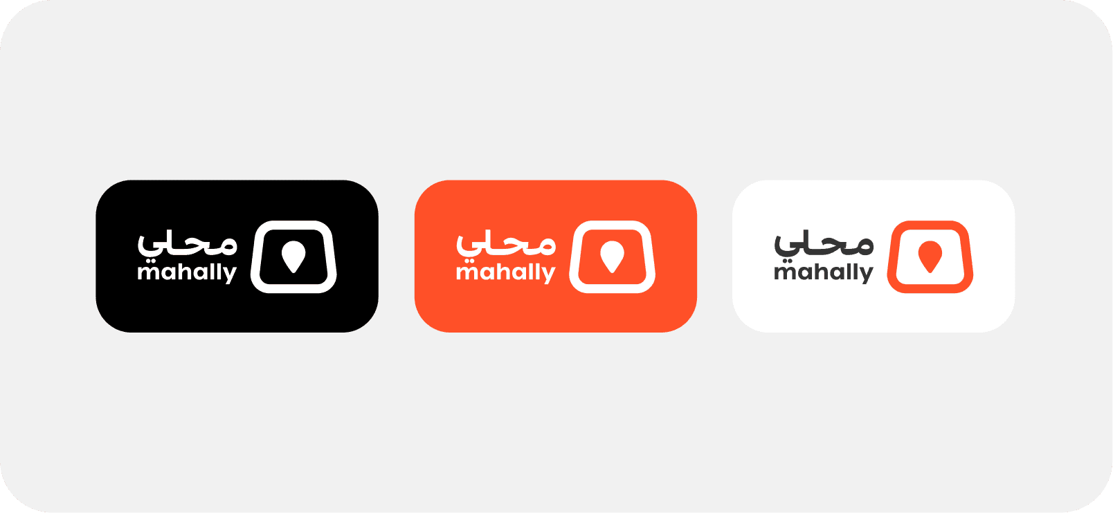
The logo must be clear, whether it is a small favicon in an app or printed on a large shipping box.

Contrast & Versatility
The logo must work in a solid white version on dark backgrounds, and in a black or colored version on light backgrounds, without losing its details.
Wordmark
Store name in a distinctive font


Pictorial
An icon representing the store


Lettermark
Short for store letters


The Compound (Combination)
Text + Icon


Moving away from overused clichés
Completely avoid using cliché and repetitive icons in the logo (such as a shopping cart or a gift bag). The customer already knows they are in an online store, there is no need to remind them of that in your logo.

Authenticity shapes identity
Study your competitors' logos to understand the general market trend, then deliberately choose a completely different visual path to stand out among them.

Simplicity does not mean transport
A successful logo must be simple and flat, without complex decorations or patterns, so that it is easy to remember and print. It must also carry a unique idea or an innovative angle that belongs to your brand alone.



Leave a safe space (padding)
around the logo in all designs.

✅ Correct (Do)
Use the icon version
only (Logomark) in narrow spaces.

✅ Correct (Do)
Logo design to be flat
without exaggerated visual effects.

✅ Correct (Do)
Place the logo inside a white box
clearly and paste it on a colored background.

❌ Incorrect (Don't)
Stretching (resizing) the logo vertically
or horizontally to fit a specific area.

❌ Incorrect (Don't)
Using drop shadows or complex
gradients inside the logo itself.

❌ Incorrect (Don't)
Colors are what define the "mood" of the store and guide the user's eye towards making a purchase.
Black and gold/silver
Luxury, watches, perfumes, high fashion.
Blue
Trust, technology, electronics, payments.
The Green
Growth, organic products, nature.
Orange/Red
Excitement, discounts, fast food (use with caution as a color for CTA buttons).
60%
Primary Color
(Often white or very light grey, or very dark if the store is in Dark Mode) for eye comfort.
30%
Secondary color
Store brand color (used in headers,
top bars).
10%
Accent color
A very clear or contrasting color (used only for buy buttons, discounts, and links).
Using bright neon colors as a store background
strains the user's eyes.

Coloring each section of the store in a different color
which creates visual pollution.

Check the contrast ratio to ensure text clarity over the background.

Unify the color of the "Add to Cart" buttons throughout the store so the user's mind becomes programmed to them.

Choose a single font that supports multiple weights
(bold, regular, light).
Make sure the numbers are clear
(very important for prices in stores).

Visual Advice
Large headings can be in a distinctive font with personality, while long texts (product description) should be in a clean and simple (Sans-Serif) font.
Using more than two fonts in the same interface
Best Product
01
Best Product
02
03
Best Product
Reducing fonts to less than 14px or 16px (hard to read on mobile).
Best Product
More than 16px
Best Product
Smaller than 16px
Best Product
Less than 14px
Reducing line height, which makes the text look cramped and straining to the eye.
The best product on the market, limited quantity, buy now!
The best product on the market, limited quantity, buy now!


Digital Cards
Using professional mockups that display the card at an angle or in 3D, along with the game/service logo, while clearly highlighting the value in a large, prominent font directly on the design.


Electronics
Photos with a white background and from multiple angles, with a close-up shot of the details and materials. You do not need to photograph an iPhone, for example, use official Apple photos.


Bookings and Services
Sell the "result" and the "feeling". Use professional photos of the work environment (such as a picture of a clean and tidy salon, or a picture of someone enjoying the service).


Fashion & Clothing
Photograph products on models (to show size and fit), then flat lay product images,
(Flat lay), and a close-up image to show the fabric material.


Print on Demand
Don't show the design as a flat image; use Lifestyle Mockups to place it on real products like t-shirts and mugs.


Unify the dimensions of all product images (for example, all 1:1 square, or 4:5 portrait).

Compress images before uploading them to maintain store speed without losing quality.

Design banners with minimal text and a clear dummy call to action (CTA) button.

Utilizing negative space (empty space)
in the banner for eye comfort.

Uploading images with non-uniform sizes ruins the grid layout.

Using random image names like IMG_001 weakens SEO and organization.

Cramming banners with offers, text, and cluttered designs reduces professionalism.

The low contrast between the text and the background makes the banner unclear and difficult to read.